Software Engineer
Nicolas Baptista
Senior Software Engineer & Software Architect
Full Stack · UI/UX · DevOps · QA · Agile

Available
Software Engineer
Senior Software Engineer & Software Architect
Full Stack · UI/UX · DevOps · QA · Agile
About
Full-stack developer with strong expertise in designing scalable and maintainable software architectures across multiple technology stacks. I seamlessly manage both front-end applications and back-end services, from REST APIs to real-time systems. Self-driven and detail-oriented, I bring hands-on experience administering cloud infrastructure, managing databases and containerization, while delivering pragmatic and creative technical solutions.
Technical stack
Work history
Side projects
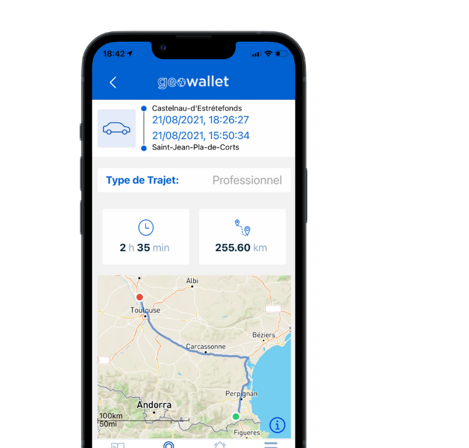
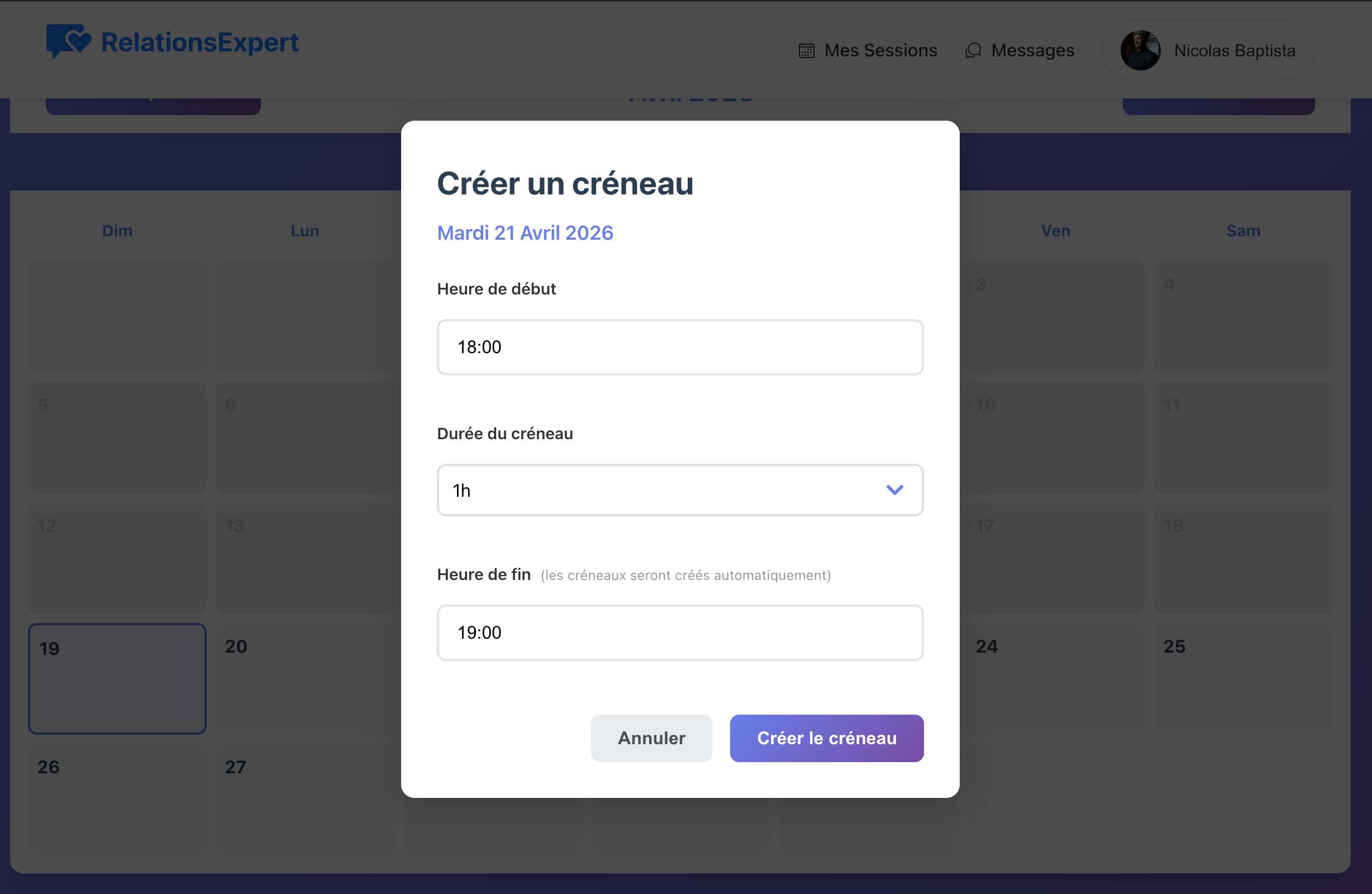
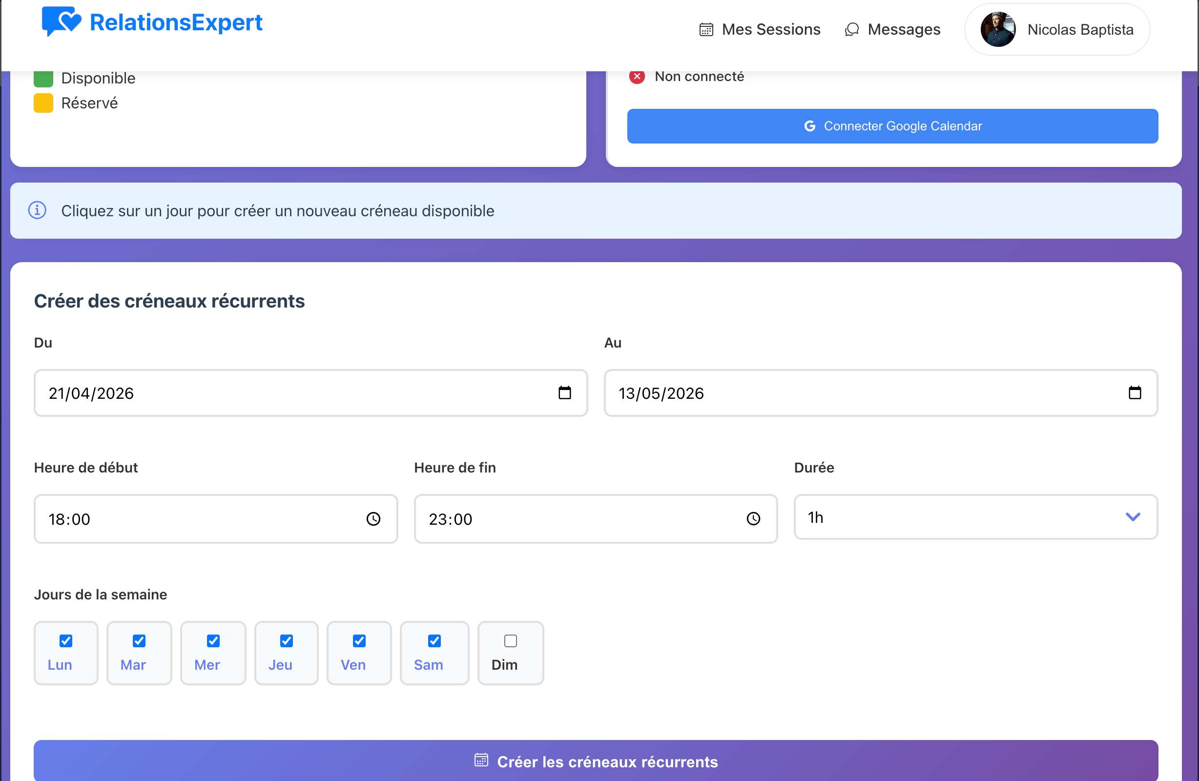
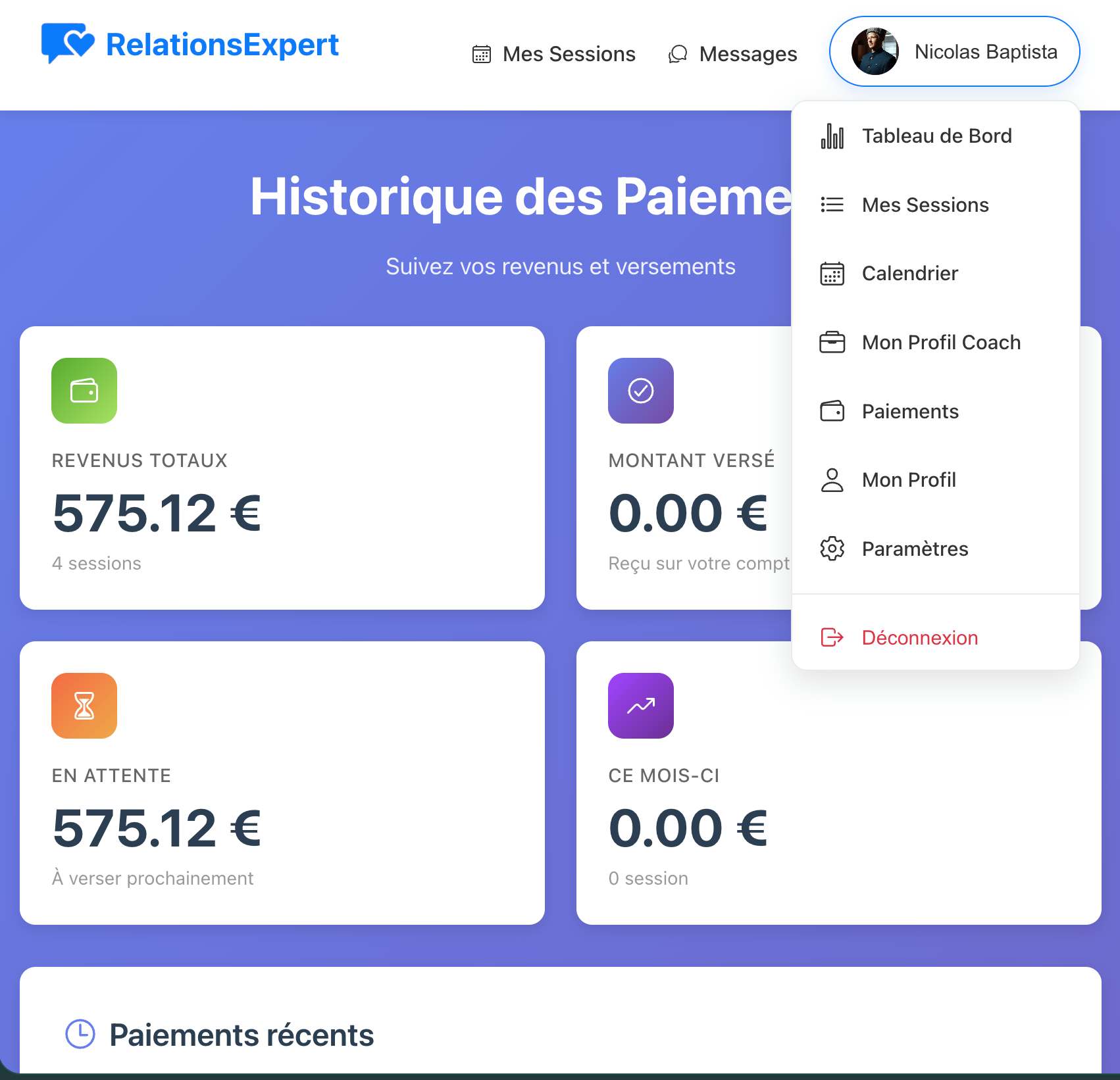
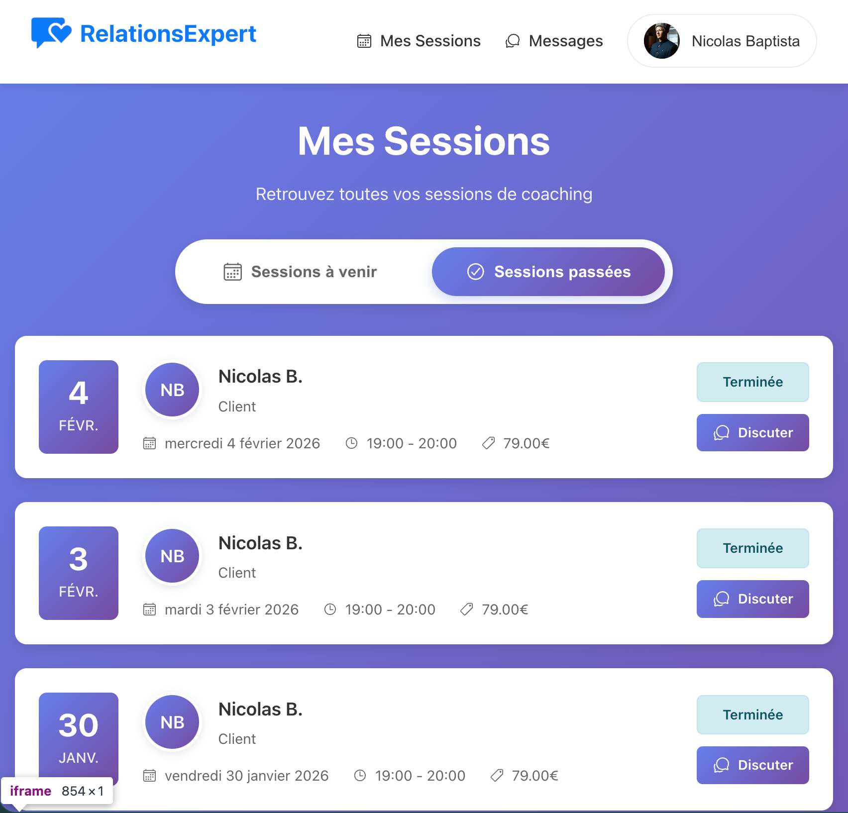
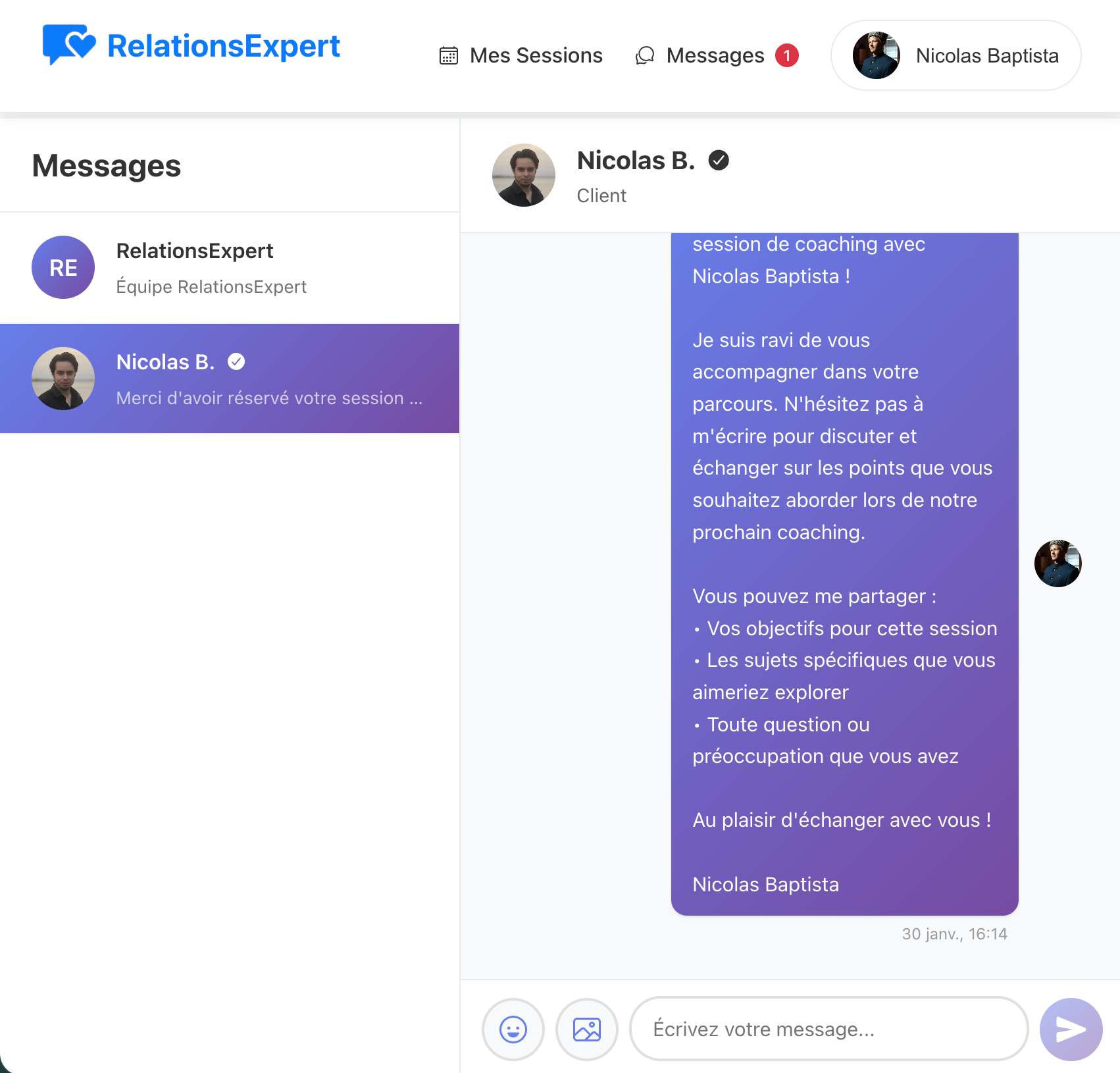
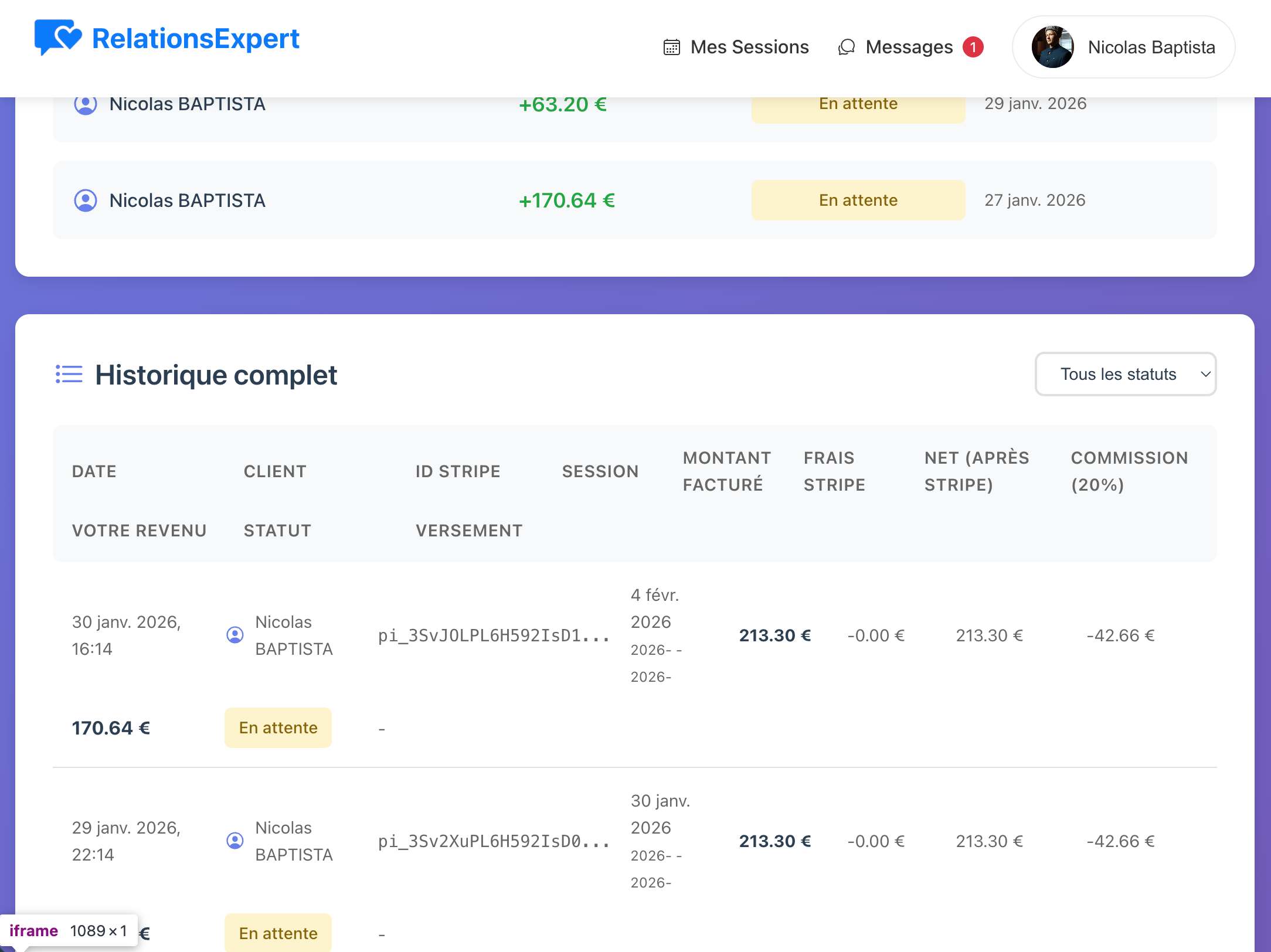
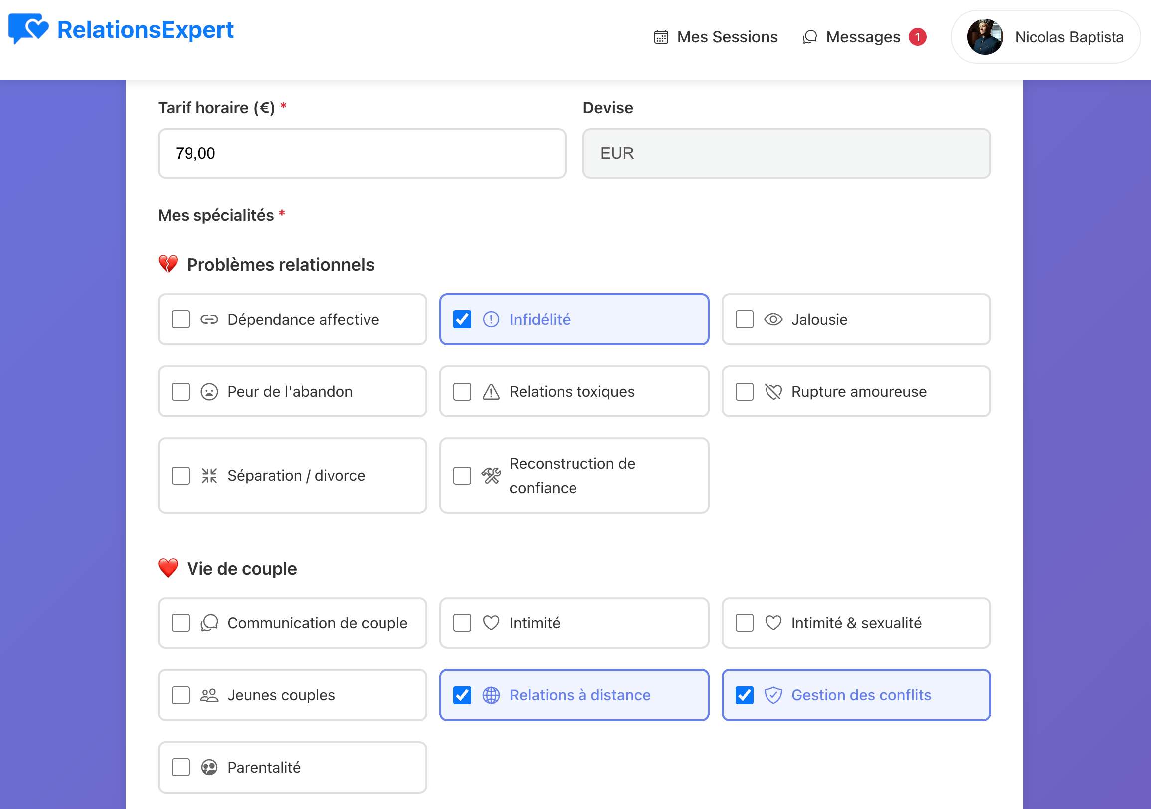
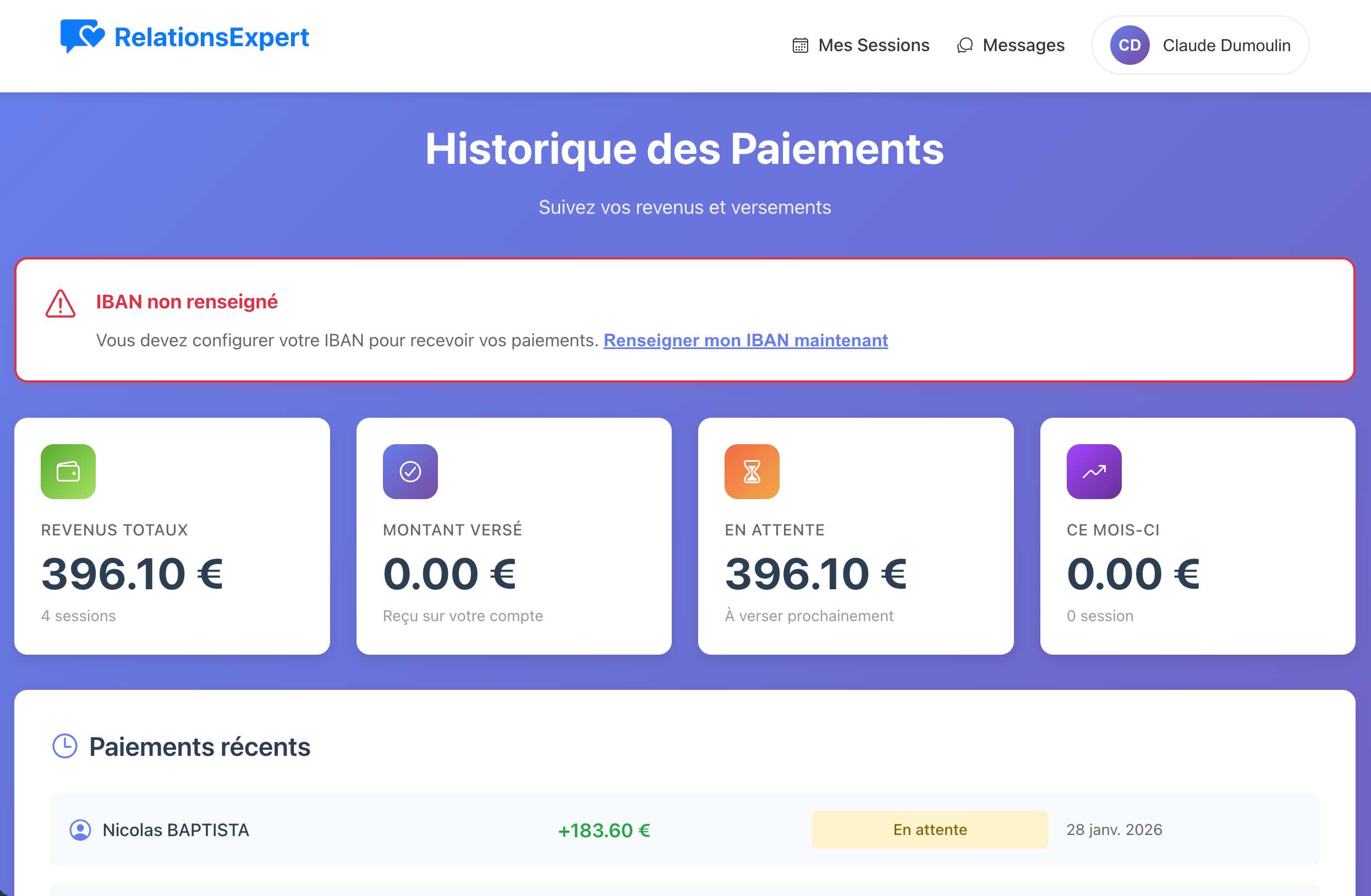
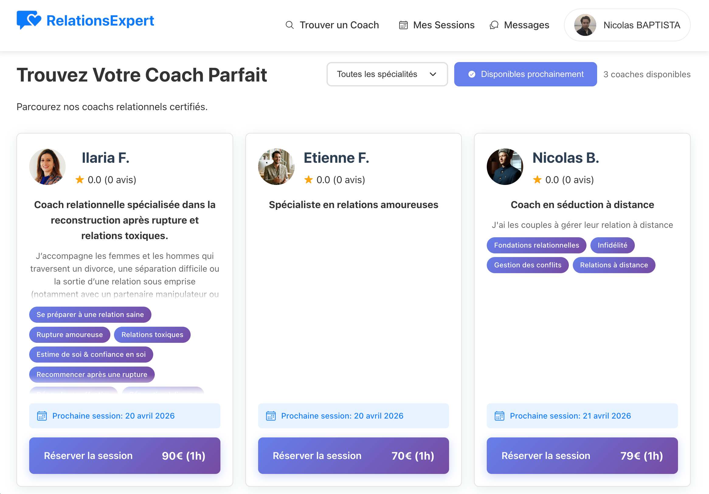
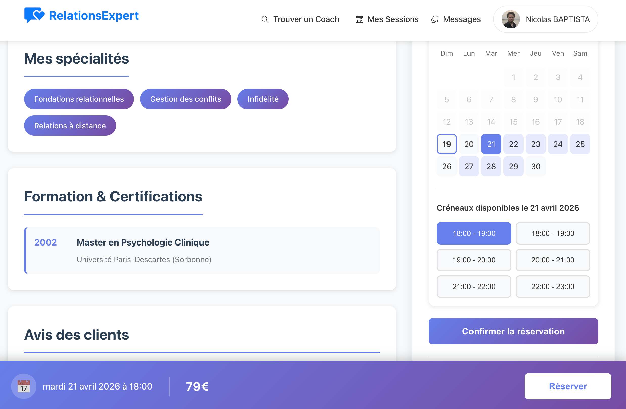
Online relationship coaching platform. Built with React.JS, Node.JS, MySQL, deployed on a VPS with Nginx and PM2. Full UI/UX design and E2E testing.
.jpg)
Personal blog covering software architecture, dev practices and tech insights. Built with WordPress and customized PHP theme.
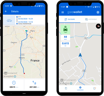
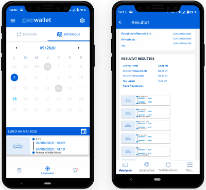
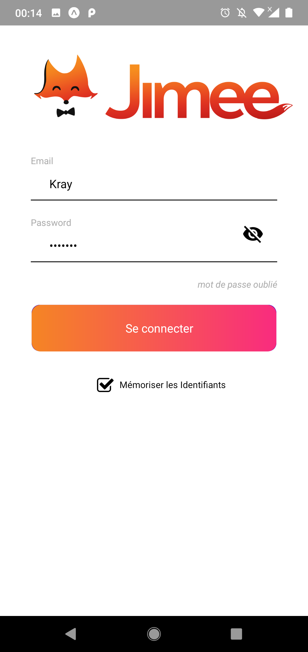
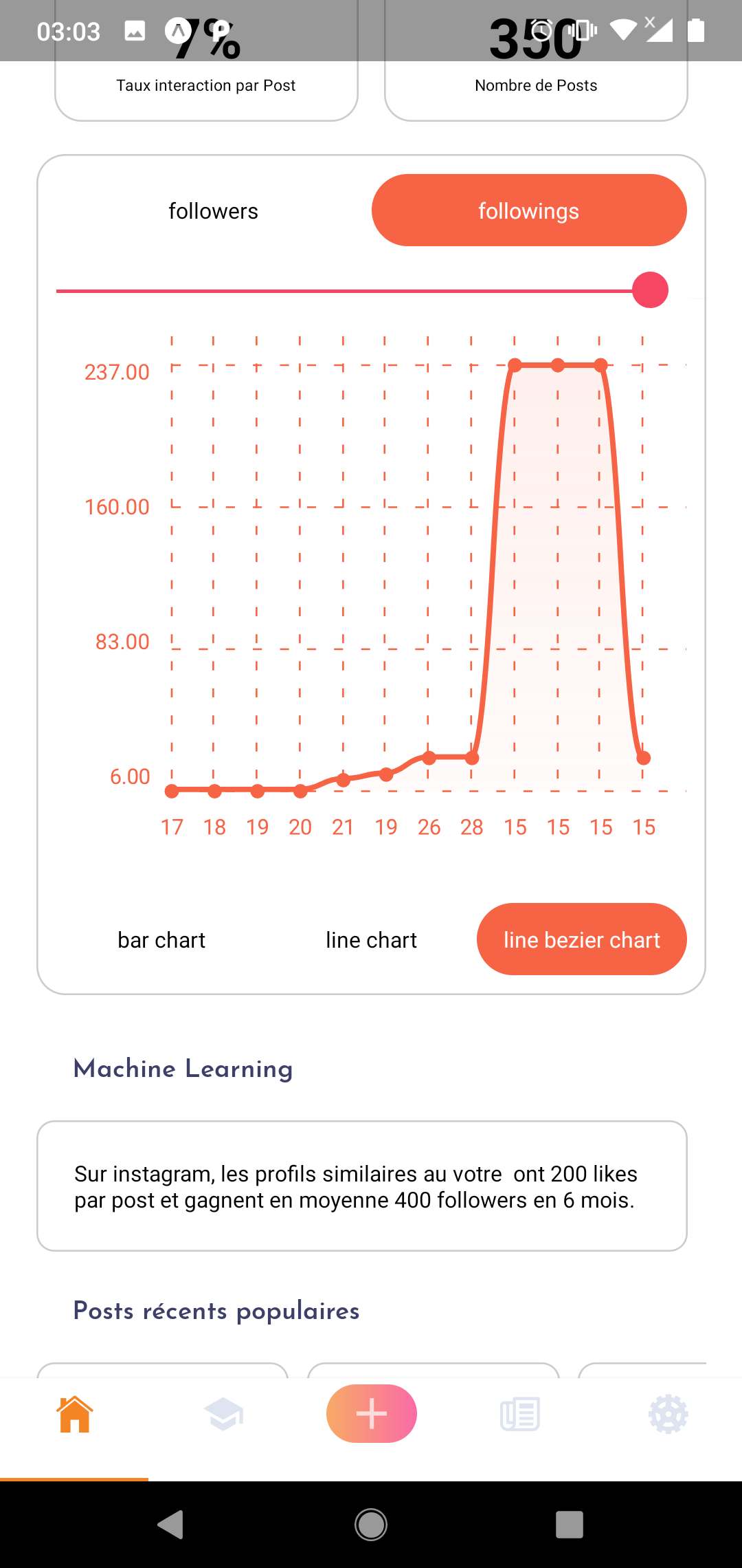
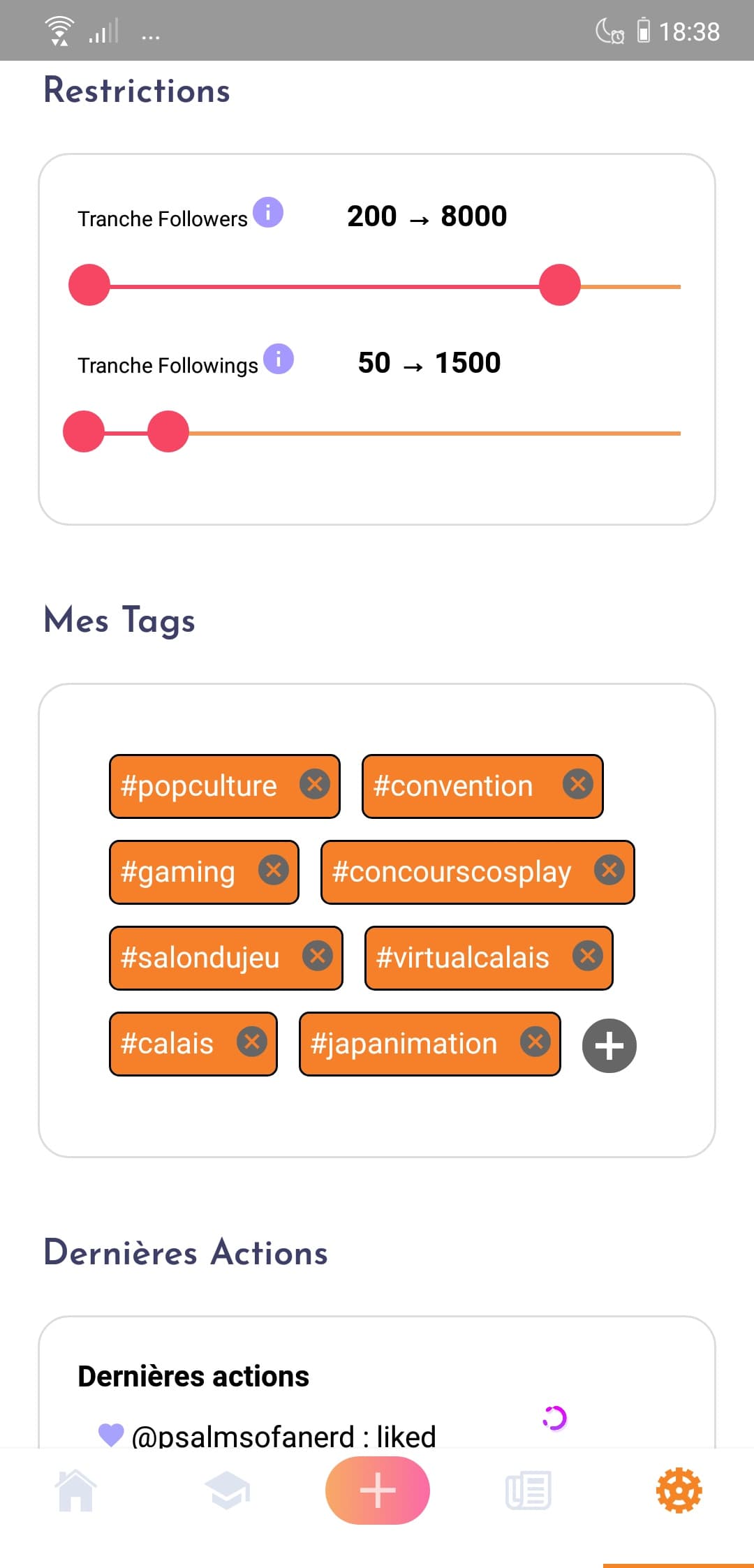
blog.nicolasbaptista.comMobile app for managing Instagram follow/unfollow actions. React Native frontend connected to a Python backend automating interactions via the Instagram API.
Community forum and tutorial platform for game development. Built from scratch at age 16 — early introduction to web development and UI design.
Presentation
Open to opportunities
Available for freelance projects and remote opportunities worldwide
Get in touch